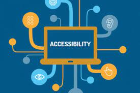
You may have an informative website with quick loading and easy navigation. But what if your web pages are not easily navigable for a blind person or if someone who cannot use a keyboard may struggle through your website? So, going forward, the need is not just for having a flashy website but to ensure that your website is accessible to all people irrespective of their skills or debilities. Remember, your web pages are never perfect without being able to speak to all sorts of people. There are many smart ways through which you can ensure accessibility of your web pages and compliance with ADA.
AccessiBe Tips for Ensuring Accessibility
In this article, we will discuss some tips from the AccessiBe experts to start your journey to making your website accessibility compliant.
1.Image alt tags
There is always an option to include an alt-tag for your website images. It is there in the custom website building platforms too now. Many people simply include a random alt tag, but one should be careful about accurately describing the image for a blind person, too, while writing the alt tag. The details of the image should be described in detail.
2.Easy navigation
There are various standard approaches to building website navigation in order to make it easier and unconfusing for the users. Well-designed navigation is the key to the success of any business website. Usually, navigation is done in a standard manner for the web surfers to move easily around the website. While planning for navigation, it is essential to consider the needs of disabled people also in mind.
3.Readability
A web page may have many elements like graphics, images, text, and many other elements to make the layout more classic and user-friendly. You may also use larger fonts on web page text, shorter and clutter-free paragraphs, and also an unobstructed page layout. However, while doing these embellishments, make sure that these do not come in the way of any disabled person to quickly access and scan through the page.
4.Ensure easy interaction for all with your site
Those people who struggle to use a keyboard or mouse may interact with the computer in several ways. Modern websites always allow touch-screen interaction. For commands, you may also ensure voice recognition and other modes of easy website navigation for people with disabilities.
5.Usage of colors
On all pages, you may try to keep the header part and navigation bars consistent so that people are not getting confused and can easily browse through the navigation section. This uniformity approach applies to the other elements on the web pages, such as buttons and checkboxes, etc. Rather than using flashy colors, it is ideal to use light and neutral colors to assist partly blind people.
As suggested by AccessiBe experts, some other considerations are ensuring the proper sizing and clarity of the web page text, ensuring responsiveness of the website, using easy-to-read fonts, and offering an easy mode of contacting you through chat or over the phone.

